Fabricate

I never would have guessed that OCAD University would give me the chance to design their graduation catalogue. It’s been so long since I have stepped foot in the school. When I accepted this project, I knew this was going to be a beautiful commissioned piece.


The aim for this project was to create a catalogue that would show case each hand designed piece of art by the student body. I wanted the work to shine and the design to compliment it.

Thus a simplistic but in yet tasteful layout was born. During the ideation phase, we went through a lot of different ideas and it was difficult to commit to one idea. I not only had to cater to the OCAD community but I also wanted to add a splash of my own style to it.

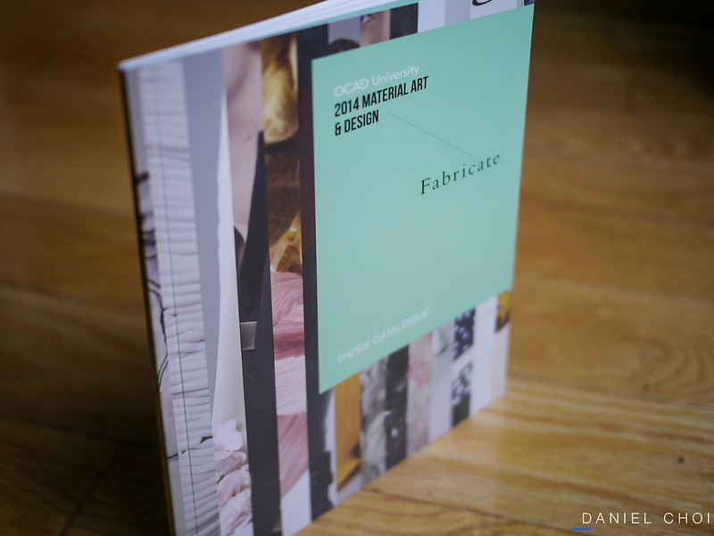
We considered a lot of different colours for this year’s catalogue. Mint green was on the top list due to its mellow and abstract nature. But the most challenging part of this design was the cover.

The cover had to portray and represent everyone in the department. I couldn’t just use anyone’s artwork and call it a cover because that would be “unfair” towards the other students who worked so hard throughout the year.

I couldn’t decide so I used everyone’s work and gave all the students the right recognition they deserve.

Here are some interior spreads form the catalogue.

Enjoy.


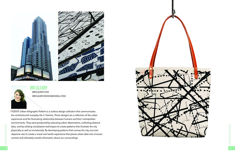
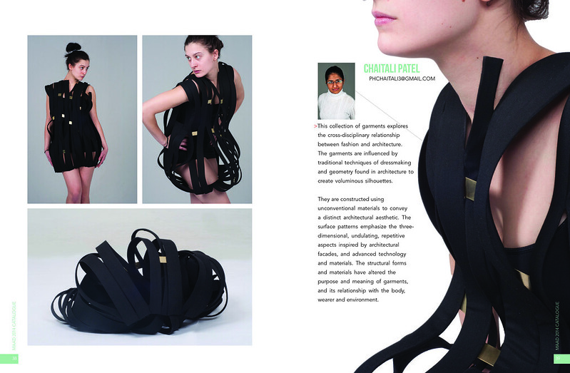
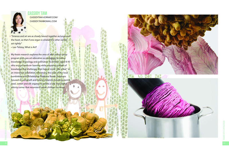
The uploads for these spreads made the colours extra bright but I want you to get a feel and flow of the book. Please excuse the off colours that you see.


Rethinking


Design is always and will be a process. Even finished designs are not complete at times due to the nature of art.

One of the most important skills of a graphic designer is to be resourceful when you are limited in resources. 

3-Minute Einstein is a perfect example of restrictions. The image of Einstein was way out of budget for our publishing house. We could have reused the previous images but we didn’t have access to them and this book was already back ordered. 

front cover

The beige cover was the original cover that another designer did, it was dated and needed a face lift for a more refreshed audience. It was still a great source of inspiration for me.

Since we didn’t have the budget to purchase the image, I had to do a live trace on Einstein and vectorize him. 

concept3

Thus a new cover was born. A face lifted version that I believe is more enticing then the previous one. It’s edgy, modern and the colour composition is attractive. Bringing Einstein back to life was not an easy task but the final product is rewarding. 

If you are interested in purchasing a copy click here (amazon.com). 

The Power of Harmony

Its always a challenge trying to find the perfect cover image. At times a designer would need to be resourceful and create their own composition.

The Power of Harmony is a perfect example of this and it never cease to amaze me how well this works.

6800112373_4a936a6eae_o 680-02755599

The story talks about two girls coming together as friends. They face different challenges through the school year and discovers a very unique bonding with each other.

I used the two stock images and combined them together to create a new image. A filter was used to portray a vintage/old school vibe, paired with a hand written style typeface that reflects a more personal touch.

If you are interested in purchase the book. Click here (amazon.com)

Cheers.


A Reliquary and Other Poems

Since we were on the topic of typography, it got me all excited and wanted to share more pieces that I have designed that was soley based on type. This book here is a collection of poems by Daryl Hine. This was his last book and I wanted to give it a superior type treatment.

This composition is basically graphic design 101. I used many different types of contrast ranging from size, texture, colour and movement. Since its Daryl’s last book, his name has to be more dominant and bold but contemporary.

The title is what captures me the most because there is a high level of contrast being presented here. They’re colour, san serif/serif type and size. To top it off I gave it movement, starting from the left and leading all the way to the right. The whole title flows very well.

But like all designs, I felt that I could have done better due to the fact that the cover stock is textured. Thus the black text disappears a little bit, you need to see it with detail in order to read the beautiful set type.

If you are interested in purchasing this book click here (Amazon).

As a bonus, here are some initial ideas that I had for the book that did not make it. Which one do you like?

Cheers

1 2

Now or Never

Coming back from a long weekend and getting back to work was always a tricky shift. Especially when you come back sore and bruised from snowboarding at Blue Mountain.  I had such a great time that I didn’t want to come back but it is time to work again.

This week I want to share this piece with you. It is an expressive typography composition that features the quote “now or never.” I was greatly influenced by Tim Burton during my years of design school and I wanted to reflect his style in this piece.

project2

The composition comprises of two different typefaces. The now is a serif type that is slowly transforming into a custom never san serif typeface that reflects nature and a grudge kind of feel. To top it off, I illustrated some very rough, straight vector drawings that benefits the marriage of the type.

Till this day the piece still speaks to me and I look back on it from time to time for inspiration.  

Mian Fan

I think its time to take a break from my book designs and talk a bit about some of my identity projects. Mian Fan was a project that I worked on during the summer of 2013. I received a panicking phone call form one of my design friends at HoK. She basically told me that she needed a logo within 5 days and briefed me with the client’s needs and wants, then she hung up.

I was a bit confused but felt privileged to work on such a project. It is a noodle house that sells Shanghai cuisine in the heart of downtown Toronto. I did some research and started to sketch out some ideas.

I wanted to emphasize on the noodles but didn’t want an overwhelming logo. The idea was to give a very minimalistic but modern design that would be timeless.

Pages from Mian Fan Concepts Pages from Mian Fan Concepts-2

The first idea that I rendered was a noodle that transformed into a bowl. Followed by a pair of chopsticks to give notion that they are noodles and also I felt that it personalizes the composition a bit more. The red and yellow represented warm, tradition and energy.

The second idea was more of a word mark rendering. The serif typeface gave a traditional/historical feel and I decided to illustration the “F” with the combination of noodles and chopsticks.

After I got feedback from the client, here is what we pushed forward with.

Pages from Mian Fan Concepts 2

Mian Fan Rendering

The rendering was done by my friend so I cannot take credit for that but the final logo consists of the red shape bowl and it conveys the warmth of the product. The gradient orange to yellow noodle speaks depth and the chopsticks that compliments the composition.

Althought Mian Fan isn’t officially open yet, I am looking forward to the day of the tasty noodles.

Bye, Bye, Butterflies

Ever since I was a kid, I have always said that picture books are the easiest books to read. Till this day, I still feel the same but designing them is a whole different story. This was one of my first picture books and certainly not the last one of its kind.

I love the fun illustrations and the engaging story about how butterflies come to be.

When I first laid my eyes on the artwork and rendering, it gave me a very comfortable vibe. The chosen palette of colours was so vivid and soft. The drawings were very unique and fresh. What it was missing was interactive typography.

The interior stays true to the cover artwork and has an abundance of playful characters. I designed the story in a way that compliments each illustration, making it more fluent and adventurous!

The most challenging part was designing the activity at the back of the book. Children would get a chance to educate themselves and share fun filled games with friends. It was challenging because there was so much information to micro manage and I needed it to be clean and informative.

If you are interested in buying the book. Click here (Amazon).

Pies Anyone?

Aside from designing and sports, I do have a culinary side of me. I really like to bake macarons and cook for my friends and family. When I received this first project of re-designing a cookbook for my publishing company, I was ecstatic. I already had the vision in mind on what type to use and an idea of the type of composition.

This is Pies. A book filled with colourful, warm and detailed images of many different pies. Throughout this design, I wanted to keep the images to dominate most of the composition. In my opinion, it wouldn’t make sense to box the beautiful full images and not give it a full bleed effect.

The instructions are clearly divided in two. The highlight black column is the essential ingredients that you need in order to bake the pie, which I found very important. Contrasted with the black is the white column, which highlights the instructions. The crisp san serif type really reminds me of the flaky crisp crust that a pie has and I wanted to reflect that meaning through the use of the san serif typefaces.

I am very proud of my first cookbook design and this is actually a series of books. On the way are more cookbooks from the same author that I am currently working on. Actually, its at the printers already. I will fill you in once I receive my copies!

Born Ugly

Born Ugly was my first book that I have ever designed. As I review and share this book with you, I have to admit it was a time of exploration I was still new to the book design genre and explored many different possible ideas.

Still to this day, I refer back to this cover design because of the powerful, simplicity and effective nature of it. This young adult novel talks about a teenage girl who gets bullied at school, she experiences verbal abuse and loneliness. All of these emotional states will drive anyone up the wall and force you to hide herself from the world.

With the story line in mind, this gave me a perfect opportunity to utilize the idea of The Ring girl imagery. Having lots of hair draped in front of her face. I topped it off with a layer of funky looking typography. This not only showed how she wanted to disappear from everything but it also portrayed her as a very insecure school girl.

The spine of my book is always one of my favourite parts. I feel that it should always stand out from the front and the back because this is the part of the book that viewers see first depending on how the book is shelved.

And it’s always nice to see your own name in your work. Remember to always give credit where credit is due.

If you are interested in purchasing this book click here.

So You Want to Write a Children’s Book

This book was one of my first published designs from Red Deer Press. I was very excited when I first got the project because it was targeted towards a more mature audience. Thus, my aim was to design a book that focused solely on typography.

20131229-P1050536

The cover design was challenging. I have to constantly ask myself, what image or composition would represent all the children’s books out there without making it look amateur.

I went through several design concepts that involved vector drawings of kids playing in a playground, coupled with beautiful san serif type. Then I had the idea of dissecting typography and identifying each detail of the letter as a term in the english language.

All of this was very complicated, I decided to go back to the basics and think about what really makes a children’s book. Then it came to me, magic was the solution.

I drew up some sketches and came up with the idea of having an open book, flaring out stars or magic dust. My inspiration came from the endless Disney movies that I watched when I was a kid.

20131229-P1050537

20131229-P1050538

The interior I felt was a breeze, it contained a lot of quotes and short lists of information. This gave me an excellent excuse to use my pull quote designs to give it a clean approach.

I have many books to share with you, so please check back next week.
Cheers.